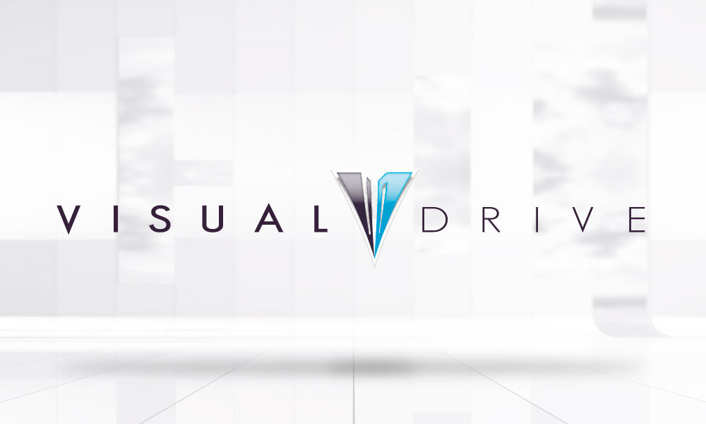
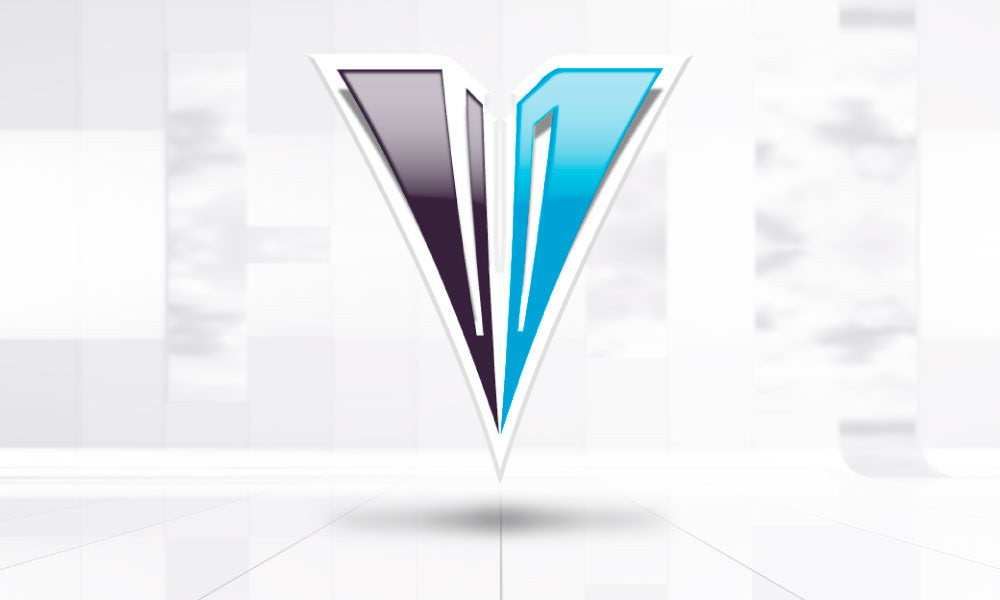
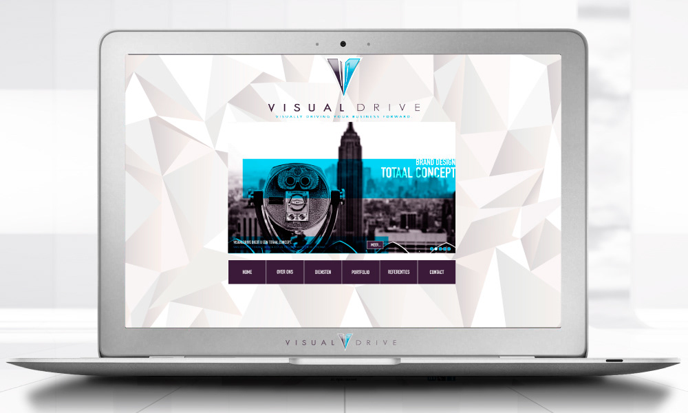
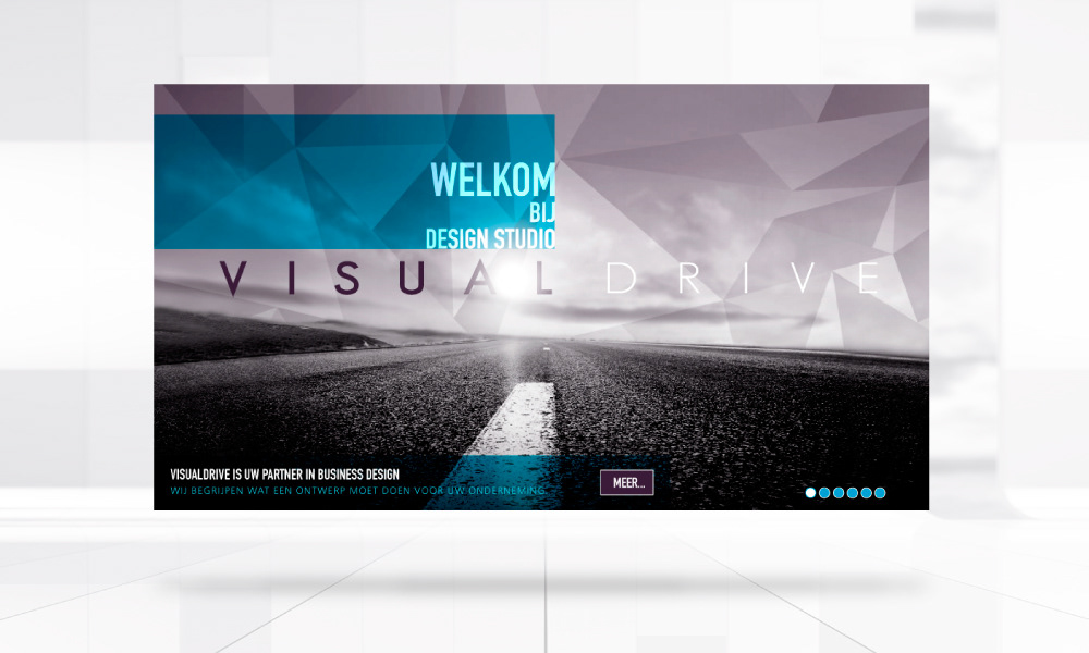
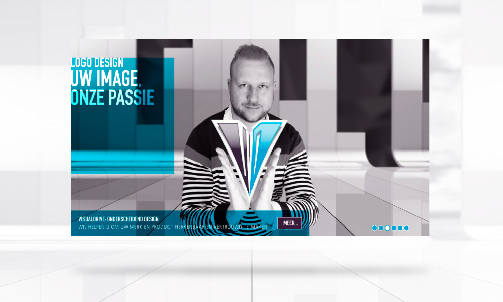
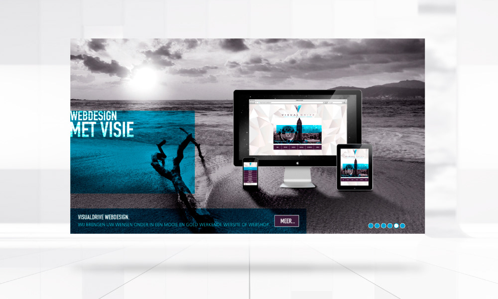
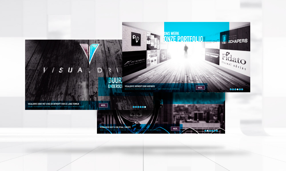
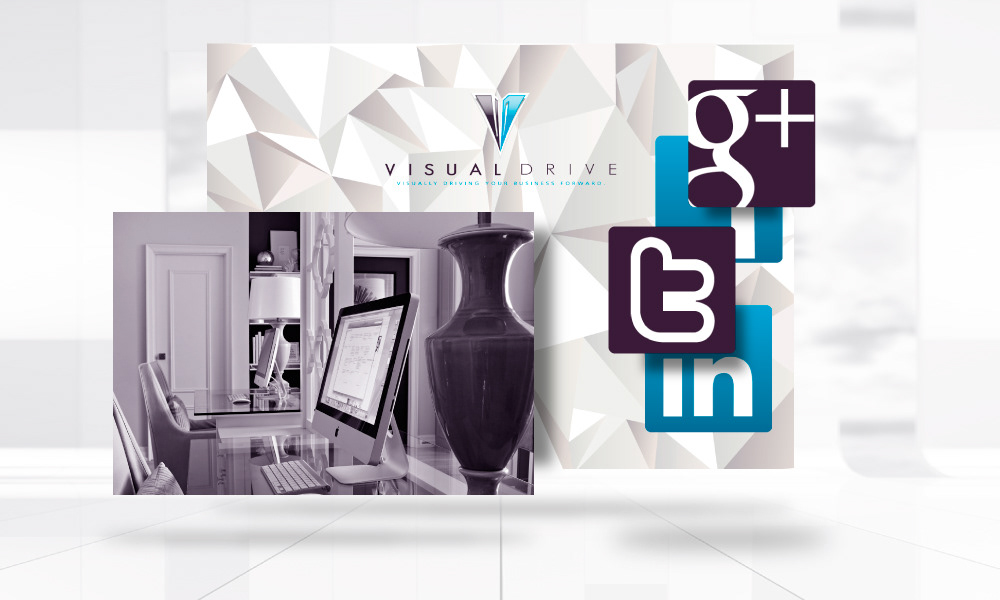
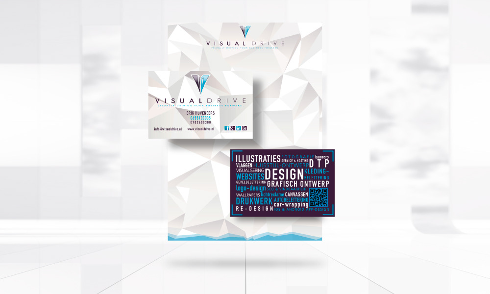
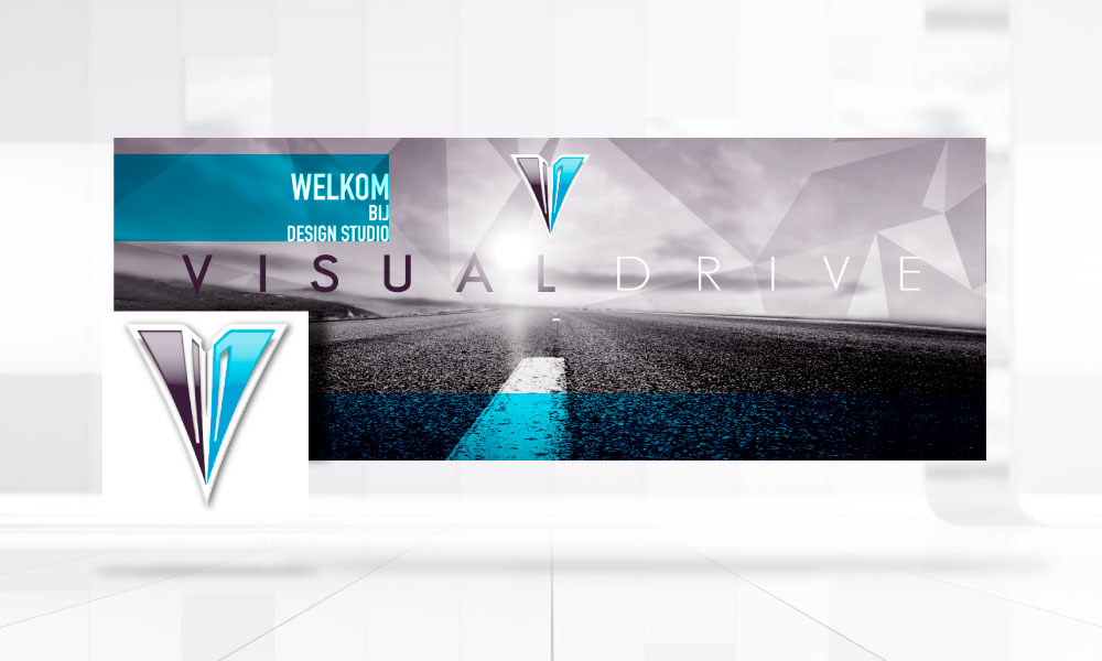
Of course I did everything on this project. Since it's the official re-design of my own rcompany's brand, website and corporate ID. I felt like I needed a more clean design. My old logo and ID was too graphic. Some customers mistook my business for Autocat/technical designer. This is the result. I wanted a clean trustworthy color together with an earth color. I ended up with this cool light blue and wine/aubergine purple. It's a clean, clash design. The V-shaped dart consists of the 'V' and 'D' of VisualDrive.